Wednesday, April 24, 2013

LIBR280_12_Book Study


Book Study:

Aunt Louisa’s Nursery Favourite


Melissa Woods
San Jose State University
LIBR280_12
24 April 2013
Professor Beth Wrenn-Estes


            Victorian Era England
            The World in 1869 & 1870
Author
Illustrators
Printer
Publishers
            Frederick Warne & Co.
            Scribner, Welford & Co.
Place of publication 
Title page
Rubrication
Incipit and explicit
Preface
Colophon Size and format
Collation Paper (watermarks?)
Page layout
Foliation/pagination
Printer's Device- Type
Color printing
Decoration 
Illumination/Painting
Binding
Endleaves and flyleaves
Conclusion/Summary
References


Towards the end of the nineteenth century and into the twentieth, Victorian England was beginning to understand childhood as a fundamentally different period of life than adulthood (McDowell, 2009).  This understanding fostered the belief that children had special needs for protection and education.  As a result, institutions specifically segregated from adults, such as playgrounds and schools, developed (McDowell, 2009).  This Victorian era development, in combination with the mechanization of printing and the ability and desire to bring print to the masses, fostered what is now known as the golden age of children’s literature (“book,” n.d.).  This period is generally seen as lasting from the 1860s to 1930s though children’s literature was being written well before this time (Carpenter, 1985).  Scholars mark the beginning of writing for children as the year 1672, but it is the nineteenth century is when the trend of writing moralistic or religious texts for children died down and fantasy took its place (Banerjee, 2007).  Additionally, it was not until 1850 that there was a stable commercial infrastructure for children’s literature and the sales of genre became a very important part of the publishing trade (Banerjee, 2007).  From this golden age, came the book Aunt Louisa’s Nursery Favourite.  During this period, Aunt Louisa was a name already established with a popular series called the London Toy Book series and many of these and other Aunt Louisa titles still exist today.  This particular book, published in 1870, is a combination of four nursery stories, in poem and verse.  The nursery stories are as follows: Diamonds and Toads, Dick Whittington, Lily Sweetbriar, and Uncle’s Farm Yard.  The book is a well preserved example of Victorian era children’s literature, produced by some of the more famous printers and illustrators of the time and as such, it stands as a wonderful example of the printing styles of that time.


England was the world’s most powerful nation during the late nineteen century (Evans, 2011).  The period is referred to as the Victorian age, so named for the monarch at the time Queen Victoria, also called the Empress of India (Evans, 2011).  This period was one of great changes due in large part to the first Industrial Revolution which created a consumer boom, growing prosperity in the nation, and a great expansion of towns and cities (Evans, 2011).  By the end of Queen Victoria’s reign in 1876, the British Empire extended over roughly one-fifth of the earth’s surface (Evans, 2011).  In neighboring Ireland, much of the population was dwindling as a result of the Great Potato Famine which lasted from 1845-1847 (Evans, 2011).  During that time, Ireland lost more that one million people to famine and far more were lost over the remainder of the century because of emigration to Australia, Britain and the Americas (Evans, 2011). 

            Civic identity and engagement were seen as extremely important during this period.  In fact, institutions such as libraries, wash-houses and swimming baths were funded as part of a “determination to provide working people with the means to improve themselves” (Evans, 2011).  The Victorian’s feeling of civic obligation also fostered a belief in charitable giving.  And as a result, many charitable organizations were formed in the nineteenth century such as the Society of the Relief of Distress and the Charity Organisation Society (Evans, 2011).


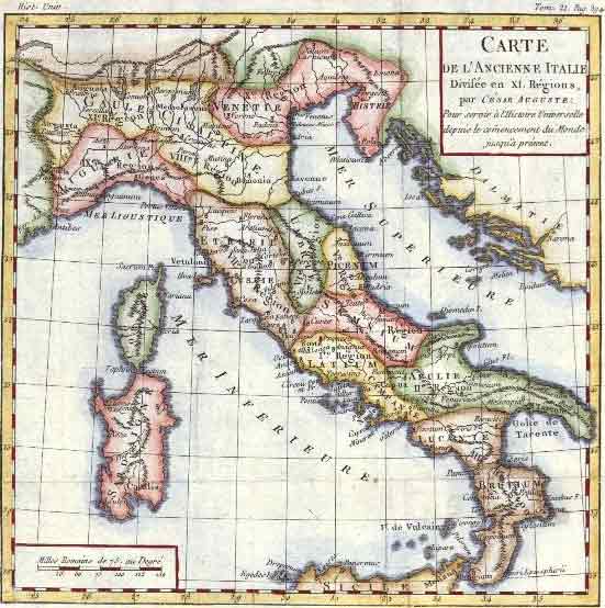
Around the word, there were many interesting developments.  For instance, in 1869, the Suez Canal was opened and the first transcontinental railroad across the United States was completed (eHistory, 2013).  Henri Matisse and Mahatma Ghandi were born that year and Tolstoy’s War and Peace was written (eHistory, 2013).  In 1870, the Franco-Prussian War began, the Kingdom of Italy was unified and Twenty Thousand Leagues Under the Sea by Jules Verne was written (eHistory, 2013).


The book is credited to Laura Valentine, or Laura Jewry Valentine, who often used the pseudonym Aunt Louisa.  Valentine was born in 1814 and died in 1899.  She has an impressive bibliography of works for children and adults and it seems that she was employed by the publisher, Frederick Warne and Co. as an editor (AbeBooks, Inc., 2013).  There are some cases where she is credited as the author of a work and in those cases she used her name rather than Aunt Louisa (Letteratura Dimenticata, 2013).  It is likely that Valentine was born in England, but little else is known about her (Letteratura Dimenticata, 2013). 


The illustrator of Diamonds and Toads, pictured above and the first story in the book, is credited to Kate or Catherine Greenaway.  Ms. Greenaway, is considered to be one of the more prolific illustrators of her time (Cavendish, 2001).  She was born March 17, 1846 in London (Cavendish, 2001).  She spent most of her year in Islington living above her mother’s store, but she spent her summers with relatives on a farm in Nottinghamshire (Cavendish, 2001).  The daughter of John Greenaway, a well known draughtsman and wood engraver, she took interest in the arts and studied at several places including the Slade School (Britannica, 2013b).  After her schooling, she began working for Christmas and Valentine’s Day card manufacturers as well as several children’s book and magazine publishers (Cavendish, 2001).  In 1868, Greenaway began exhibiting her drawings and she produced her first successful book in 1879 (Britannica, 2013b).  Her illustrations were highly regarded by art critics and her popularity spawned dolls, pottery, clothing lines, and in France there was even a children’s dress style called ‘Greenwayisme’ (Cavendish, 2001).  Kate died of cancer in London on November 6, 1901 and today she is considered the “uncrowned queen of the golden age of children’s book illustration” (Cavendish, 2001).  Unfortunately, the illustrator of the remaining stories is unknown.


            The printer of the illustrations was Joseph Martin Kronheim, a well known printer in the late nineteenth-century.  Kronheim was born in Madgeburg, Germany on October 26, 1810 (The New Baxter Society, 2013a).  At the age of 32, after living in Paris and Edinburgh, Kronheim moved to Paternoster Row in London (The New Baxter Society, 2013a).  Four years later he purchased a license to operate the Baxter process which is a process that uses wood and metal color blocks in conjunction with steel key plates to produce prints using oil-based inks (The New Baxter Society, 2013b).  The process, patented by a man named George Baxter, enabled cheaper and more effective color printing and it was often used in book illustration (The New Baxter Society, 2013b).  Kronheim found the Baxter process to be very time consuming and adapted the process using zinc blocks, but it resulted in a flatter finish (The New Baxter Society, 2013a).  Unsatisfied, he tried lithography but ultimately returned to using the Baxter process (The New Baxter Society, 2013a).  After the Paris Exhibition in 1855, Kronheim sold his share of Kronheim & Co. and retired to Germany (The New Baxter Society, 2013).  The retirement did not last long as shortly after Kronheim tried, unsuccessfully, to establish a printing business in America (The New Baxter Society, 2013a).  He eventually rejoined his old company in London and in 1875, the company stopped using the Baxter process and installed steam litho machines instead (The New Baxter Society, 2013a).  In 1887 Kronheim retired again (The New Baxter Society, 2013a).  He died in Berlin in 1896, at the age of 85 (The New Baxter Society, 2013a).


            Aunt Louisa’s Nursery Favourite lists two publishers.  The first, Frederick Warne & Co. was a publisher based in London.  It was founded in 1865 by Frederick Warne, a bookseller turned publisher and during the nineteenth century, the company built its reputation on it’s children’s books (Barton, 2013).  Towards the end of the century, Frederick Warne retired and handed the company over to his three sons (Barton, 2013).  The company is most well known for being one of the six publishers to whom Beatrix Potter submitted her first book (Barton, 2013).  Initially Warne turned to book down, but after seeing a privately printed edition in 1901, they changed their minds and offered to reprint the book if Potter did the illustrations in color (Barton, 2013).  Potter complied and The Tales of Peter Rabbit was published by the company, the beginning of a partnership lasting over forty years (Barton, 2013).  In 1983, Frederick Warne & Co. was acquired by Penguin Books and as a division of Penguin, the company continues to publish children’s books today (Barton, 2013).


The firm began with Charles Scribner I and Issac Baker in January of 1846, and was called Baker & Scribner (Princeton University Library, 2002).  It was based out of the Brick Church Chapel in New York City until 1856 when the sale of the church forced the company to relocate to Broadway (Princeton University Library, 2002).  Prior to the move, Issac Baker died and as a consequence, in 1851, Charles Scribner I assumed full responsibility of the company and changed the name to Charles Scribner & Co (Princeton University Library, 2002).  Shortly after the company moved, they took on a new partner named Charles Welford, the son of an English bookseller (Princeton University Library, 2002).  He was given 1/3 share of the company to establish a separate company, Scribner & Welford, for the importing of foreign books (Princeton University Library, 2002).  When Charles Welford moved to London in 1864, Scribner & Welford established a presence in both New York and London (Princeton University Library, 2002).  The company continued well after Charles Scribner I and Charles Welford’s deaths in 1871 and 1885 respectively (Princeton University Library, 2002).  The company’s partners and name changed frequently until 1891 when Scribner & Welford was subsumed under the name Charles Scribner’s Sons and all business has been conducted under that name until the present day (Princeton University Library, 2002).  In 1999, the company joined Gale Cengage Learning and in 2004, they won the Dartmouth Medal for their Encyclopedia of Food and Culture (Cengage Learning, 2012).  Charles Scribner’s Sons has a long and well established history which included the Scribner Book Store which was in New York on Fifth Avenue from 1913 until 1989 (Princeton University Library, 2002).  That building, which bears the company’s name on the side, was established as a landmark of New York City in 1962 and remains to this day (Princeton University Library, 2002).


There are two places of publication listed; London and New York.  London is the first location listed and it is clearly considered more important as it is listed in a larger font.  New York is listed much lower down on the page and is in a smaller font.


Title pages originated from two very distinct needs.  First, as books were commercial products, it made sense to place all of the advertising information in the front of the book so that it could be easily seen by potential buyers (Frazier, 2003).  Second, because books were sent to sellers prior to being bound between covers, it became necessary to protect the book, especially the first page, from being dirtied (Frazier, 2003).  At first, a blank page was added to protect the page, but this obstructed the book’s identity (Frazier, 2003).  To identify the book printers added a page with just the title of the book, called a half-title.  Eventually, the half-title evolved into a full title page though the half-title is still seen in books today (Frazier, 2003). 

The title page of Aunt Louisa’s Nursery Favourite is relatively simple, though it does highlight some of the developments of title pages from their inception.  In the fifteenth century, English title pages were often simple but would include large printer’s marks that took up the majority of the lower half of the page (Pollard, 1891).  Towards the middle of the sixteenth century, the printer’s mark reduced in size, but it became fashionable to fill the entire page with large woodcut borders, which often only left a small area to include the page’s important information (Pollard, 1891).  It was also around this time, 1520, where the year of publication began appearing in Roman numerals on the bottom of the page (Pollard, 1891).  This did not last long since unique woodcut blocks could only be used for one publication and, toward the end of the century, the borders reduced in size and took the form of repeatable arabesques, architectural designs, or sculptural figures (Pollard, 1891).  During the seventeenth century, title pages generally included only text, often of different sizes and fonts (Pollard, 1891).  The page was usually crowed and often contained a “resume of the book” (Cole, 1971).  The style lasted into the eighteenth and nineteenth centuries, though the page eventually became less crowded (Cole, 1971). 

This particular title page fits with the style of its time.  There are several different fonts and font sizes and the page has a significant amount of information.  We can also see that the fonts are generally larger on the top half of the page and reduce in size towards the bottom.  Lastly, there is a publisher’s mark towards the bottom of the page as well as the date of the publication.


There is no rubrication used in this text.  In fact, there is no red ink used in the text block at all. 


There is no incipit or explicit.  The absence of an incipit or explicit is consistent with the time of the book’s publishing.  Incipits and explicits served very important purposes when manuscripts were being produced, however in later printed titles, it seems that they fell out of disuse or, in the case of explicits, were replaced by colophons (Cole, 1971).


This book includes a preface.  Prefaces, or a statement written at the beginning of a literary work which generally explains its scope or methodology, go very far back in the oral and literary tradition (Dictionary.com, 2013).  “For example, in the Gilgamesh epic the first tablet includes the author’s ‘introduction’ to the tale of Gilgamesh” (Zepetnek, 2009).  In the case of Aunt Louisa’s Nursery Favourite, it is an editor’s preface.  This particular preface is interesting as it aligns itself with the other Aunt Louisa Toy Book series, though this particular book is not considered to be part of the series itself.  So it not only functions as an explanation of the work, but an advertisement as well.


            There is no colophon for this text.  The importance of colophons gradually dwindled into the sixteenth century, as the title page became widely used (Cole, 1971).  Though during the sixteenth century, it was common for a book to have the title page and colophon (Cole, 1971).  There was a resurgence of colophon use in the nineteenth century as private presses began to re-emphasize their fine printing and skilled craftsmanship, but since this book was intended for mass production, it would have been unlikely for it to have a colophon (Cole, 1971).

During the nineteenth century, and still today, the size of the book is generally related to the way in which it was printed.  Often multiple pages were printed onto one full sized sheet of paper and then folded into signatures which could be sewn into a complete book (Allen, 1981).  If two pages were printed on a sheet, the size would be a folio, four pages would be a quarto, eight an octavo and so on (Allen, 1981).  This naming convention is still used today though the style of printing has changed (Allen, 1981).  In this case, the book was only accessible online and there was no size listed so an exact size of the book is unknown.


The book begins with an illustration and is followed by the title page and preface.  There is a rudimentary table of contents included within the title page which lists each nursery tale; however no page numbers are given.  The main text block of the book is arranged in four parts, one for each nursery tale.  Each story is arranged first with the half-title, then the first page of text. The illustrations are interleaved within the text, though the stories always begin and end with a text page.  And each illustration has a blank page preceding it.  There are no visible watermarks on the pages of this book. 


William Morris, a well known nineteenth century printer, had much to say about the way a book should be designed.  His conception of the ideal book was one where the “font ought to be delicate…the text should be properly set in the page, allowing for a decent size margin on all sides…[and] ideally the book should have hand made paper” (Fawcett-Tang & Mason, 2007).  Had Aunt Louisa’s Nursery Favourite been compared to Morris’ standard, it would have most likely failed. 

In this case, the page layout is dependent on the story.  In three of the stories, the text pages have significant amounts of space between lines and there are small margins.  The pages are completely taken up with text and the edges of the text are justified.  Lily Sweetbriar, a poem, is laid out differently from the rest of the text.  In this section of the book, the margins are very wide.  The lines of text are very close together and at the end of each four-line paragraph, there is a one-line space.  Additionally, every other line is indented and the text edges are not justified.


The pagination of this book is quite interesting.  The text pages of each story are numbered but the numbering is based on each story as opposed the entire book.  So each story begins with page one.  Additionally, the illustration pages, the interleaving blank pages, and half-titles are not accounted for.  So, even if page two had an illustration or a blank page directly following it, page three is considered to be the next text page following page two.


            There is no printer’s device in this book, but there is a publisher’s device.  It is a circular device for Frederick Warne & Co.  The main design is three flowers that are in the shape of a stylized ‘W’.  This is outlined by a thick circular margin with the location of the publisher written within it.  Finally, there is an outer circle which is decorated with flowers as well. 

In Aunt Louisa’s Nursery Favourite, we can see all three examples of type.  The title page shows one line of gothic style type, “Printed in Colours by Kronheim,” (pictured above) while the rest of the page is in roman type (pictured below).  This is in line with the printing trend of the time which favored the roman type which, since it became popular in the sixteenth century, has been considered the ‘standard’ typeface of book typography (“roman(typeface)”, n.d).  On the text leaves of the stories, the top margin has one line of text in italics and the text block is, again, a roman type.  More specifically, it is most likely that the roman typeface is from the Transitional family. 

The Transitional family of typeface is so named because it marks a period of transition from the Old Style and Modern typefaces (Bevington, Craig, & Scala, 2012).  It is characterized by a greater contrast in the thick and thin strokes than the Old Style, the stress of the letters is almost vertical, and the serifs are not has heavily bracketed as the Modern typeface (Bevington, Craig, & Scala, 2012).  Baskerville type, a very popular Transitional typeface named for its creator John Baskerville, is considered to be one of the most pleasant and readable typefaces of this style (Bevington, Craig, & Scala, 2012).  This book is considered to have a Transitional typeface because the thick and thins are of a greater contrast than the Old Style, but the serifs are not block or slab serifs as they would be in the Modern class of typeface.


There are a total of twenty-four color illustrations included in Aunt Louisa’s Nursery Favourite.  It is most likely that the color printing of the book was either the Baxter process, which is described earlier in this blog, or chromolithography.  Chromolithography is a very time consuming process of printing where each color is printed separately using different stones prepared by the lithographic process (Nadeau, 2013).  It was a very expensive process at the time and was reserved for only the most expensive books (Nadeau, 2013).  More likely then not, the Baxter process was used to prints these illustrations.  Especially since according to his biography, Kronheim mainly used the Baxter process until 1875 when his company switched to steam litho machines.  And as the book was published in 1870, it would make sense that the Baxter process was used to produce these prints.


Aside from the color illustrations, there are several printed decorations throughout the text.  The first form is a decorated initial at the start of each story.  The initials are simple, two-line designs.  There is also an ornamental line between the large and the beginning of the text on the first page of each story.  Finally, some of the stories end with a page where the text only fills half the page.  In order to fill the page, the printer adds a decorative element.  None of the text decoration is printed in color.


There is no illumination or painting in this text. 


The book is beautifully bound in dark blue leather with a gilt title and ornaments.  On the front cover, there is an outside gold border as well as a leather tooled inner border surrounding the title of the book.  The title is also gold leaf and is extremely ornate.  The back cover has the same leather tooled border as the front, but does not have any gilding.  The binder of this book is unknown.


The front and back of the book each have one pastedown and one blank flyleaf that make up the endleaves of the book. 


Aunt Louisa’s Nursery Favourite is an exemplary example of nineteenth century British children’s literature.  The tales within are classic British nursery tales, some which have lasted throughout the centuries (the author has a good friend goes by Dick Whittington, the protagonist in the second tale).  Because it brings together several of the well known artists, publishers, and printing techniques of the time, a significant amount can be learned from this text.  Interestingly, this book is in near pristine condition which suggests that it was probably seldom used.  A fact that one the one hand is quite sad, but on the other hand means that the book is wonderfully preserved in all of its Victorian era glory.

[top]


AbeBooks.com. (2013). Aunt louisa laura valentine. Retrieved from: http://www.abe

books.com/book-search/author/aunt-louisa-laura-valentine/page-1/


Allen, J. (1981). Popular french romanticism: Authors, readers and books in the 19th

century. New York: Syracuse University Press.


Banerjee, J. (2007). What is children’s literature? Retrieved from: http://www.victorian

web.org/genre/childlit/definitions1.html


Barton, S. (2013). Frederick Warne. Retrieved from: http://www.us.penguingroup.com/

static/pages/publishers/yr/frederickwarne.html


Bevington, W., Craig, J., & Scala, I. (2006). Designing with type, 5th edition: The

essential guide to typography. New York: Random House Digital.


book. (2013). In Encyclopædia Britannica Online Academic Edition. Retrieved from:

http://www.britannica.com/EBchecked/topic/73295/book


Carter, H. (1985). Secret gardens: A study of the golden age of children’s literature.

Boston: Houghton Mifflin.


Cavendish, R. (2001). Death of Kate Greenaway. History Today, 51(11).  Retrieved

from: http://www.historytoday.com/richard-cavendish/death-kate-greenaway


Cengage Learning. (2012). Charles Scribner’s Sons. Retrieved from: http://www.gale.

            cengage.com/scribners/


Cole, G. (1971). The historical development of the title page. The Journal of Library

History, 6(4), 303-316.


eHistory @ The Ohio State University. (2013). 19th Century Timeline. Retrieved from:

http://ehistory.osu.edu/osu/timeLine/timeline.cfm?Era_id=13


Evans, E. (2011). Overview: Victorian Britain, 1837 – 1901. Retrieved from: http://www.

bbc.co.uk/history/british/victorians/


Fawcett-Tang, R., Mason, D. (2007). Experimental formats and packaging: Creative

solutions for inspiring graphic design. Massachusetts: Rockport Publishers.


Frazier, A. (2003). The title-page: Its early development, 1460-1510 [review]. Libraries

& Culture, 38(1), 76-77.


Gilchrist, D. (1947). Title Pages : A Footnote to the History of Printing. University of

Rochester Library Bulletin, 3(1), Retrieved from: http://www.lib.rochester.edu/

index.cfm?PAGE=2441


Images of Aunt Louisa’s Nursery Favourite is courtesy of the San Francisco Public

Library and the Internet Archive.  The book read be found here: http://archive.org/

details/auntlouisasnurse00vale


Images other than the book are courtesy of Wikimedia Commons


"Kate Greenaway." In Encyclopædia Britannica Online Academic Edition. Retrieved

from: http://www.britannica.com.libaccess.sjlibrary.org/EBchecked/topic/245130/

Kate-Greenaway


Letteratura Dimenticata. (2013). Aunt Louisa’s Books. Retrieved from: http://www.

letteraturadimenticata.it/AuntLouisa.htm


McDowell, K. (2009). Toward a history of children as readers, 1890-1930. Book History,

12, 240-265.


Nadeau, L. (2013). Chromolithography. Retrieved from: http://www.photoconservation

.com/index.php?option=com_content&view=article&id=125:chromolithography
&catid=35:printprocesses&Itemid=63


Pollard, A. (1891). Last words on the history of the title-page, with notes on some

colophons and twenty-seven fac-similes of title-pages. London: J.C. Nimo. Retrieved from: http://archive.org/details/lastwordsonhisto00polluoft


Preface. In Dictionary.com. Retrieved from: http://dictionary.reference.com/browse/

preface


Princeton University Libraries. (2002). Scribner chronology. Retrieved from: http://libr

ary.princeton.edu/libraries/firestone/rbsc/aids/scribner/index.html


roman (typeface). (n.d.). In Encyclopædia Britannica Online Academic Edition.

Retrieved from: http://www.britannica.com/EBchecked/topic/507251/roman


The New Baxter Society. (2013). Joseph Kronheim. Retrieved from: http://newbaxter

society.org/kronheim.aspx


The New Baxter Society. (2013). The Baxter patented process. Retrieved from: http://

newbaxtersociety.org/georgebaxter.aspx


Zepetnek, S. (2009). The social dimensions of fiction: On the rhetoric and function of
prefacing novels in the nineteenth-century canadas. Comparative Literature and Culture (Library). Retrieved from: http://docs.lib.purdue.edu/clcweblibrary/ totosystudyofpreface
[top]


Monday, March 4, 2013

Manuscript Study LIBR284_12


Manuscript Study:

Summa de Casibus Conscientie --- Confessionale


Melissa Stone

San Jose State University

LIBR280_12

Professor Beth Wrenn-Estes


Table of Contents
Figure 1: Summa de Casibus Conscientiae --- Confessionale
           Europe-14th and 15th centuries
            Italy-14th and 15th centuries
            The Dominican Order
            Initials


Not everything to learn from a manuscript is gleaned from understanding its text.  A manuscript, written in a language that is no longer understood by the majority can still bring to light a rich and interesting history.  Take the manuscript being analyzed here; a combination of two related texts of Dominican origin called Summa de Casibus Conscientiae --- Confessionale.  By combining what information we see on the page with the history surrounding its creation, we can gain a better understanding of the written word at the time that this manuscript was produced.  Summa de Casibus Conscientiae --- Confessionale  was written in the Dominican convent of San Donato which is near Urbino, Italy sometime between the years of 1385 and 1399 (OCLC, 2013).  It is comprised of two major Dominican treatises on Canon Law (OCLC, 2013).  This paper well attempt to analyze the manuscript's production within a historical context in order to gain a better understanding of the Italian medieval manuscript. As we analyze the text it is important to note that references to certain folios are based on the modern foliation which is faulty but still considered usable as a reference point.
Europe – 14th and 15th centuries
Though the manuscript was not dated by its scribe, it is believed to be written sometime between the years 1385 and 1399.  At this time, elsewhere in Europe, the Ming Dynasty was just beginning and the Hundred Years War between France and England was in full swing (Pearson Education, 2007, Encyclopaedia Britannica, 2013).  Religious reformations were also taking place around this time.  The Great Schism, where rival popes in Rome and France were fighting for control of the Roman Catholic Church, began in 1378 and the religious reformer John Wycliffe was busy translating the Bible from Latin to English (Pearson Education, 2007).

Figure 2: Italy (Wikimedia, 2013)
Italy-14th and 15th centuries
Italy, during the 14th and 15th century, was a place of turmoil and as such it is considered extremely difficult to discuss Italy’s history as a whole during this period (Larner, 2013).  The country was politically divided between six major, and 15-20 minor, political powers which produced an overwhelming trend of local patriotism (Larner, 2013).  Despite the lack of loyalty to Italy as a whole, the country had a thriving economy through the 14th and early 15th century (Larner, 2013).  This was especially exceptional given that the country was also mired with a string of famines between the years of 1339-1375, large-scale wars, and the arrival of the Black Death which ravaged Italy starting in the mid-14th century (Larner, 2013).
But Italy’s economic growth did not wane. This growth coupled with cultural change fostered the growth of the Renaissance, which began towards the end of the 14th century (Larner, 2013).  The Renaissance brought about the idea of ‘rebirth’ and it was during this time that philosophers believed the medieval man was being reborn into the modern man (Larner, 2013).  The Early Italian Renaissance also marked the emergence of humanism, or the study of the humanities (grammar, rhetoric, history, poetry, moral philosophy, etc.) as read in Classical Latin and, sometimes, Greek texts (Larner, 2013).  Within the many universities that were thriving at ths time, the Order of Preachers, were also growing in popularity.

Figure 3: Shield of Dominicans (Wikimedia, 2013)
The Dominican order was a relatively new institution at the end of the 14th century.  They were founded by St. Dominic around 1217 in response to the perceived excess of orthodox preachers at the time (The Dominican Friars, Province of St. Albert the Great, 2012).  The Order’s popularity spread and by 1221 many Dominican centers had been established in university towns, including Bologna where one of the authors of the manuscript studied (The Dominican Friars, Province of St. Albert the Great, 2012).  During the 13th and 14th centuries, the Dominicans gained a reputation for being poor in riches, but dedicated and highly educated preachers (The Dominican Friars, Province of St. Albert the Great, 2012). 
The Orders' popularity and quick growth led to changes in their doctrine. One such change was the rise of Mysticism, particularly in Italy and Germany (Gardner, 1908). One popular figure associated with Dominican Mysticism at the end of the 14th century was St. Catherine of Siena (Gardner, 1908).  She was a Dominican nun who in 1366 experienced what she called a ‘mystical marriage’ to Jesus (Gardner, 1908).  And after this and several other religious experiences, Catherine became a counselor and spiritual teacher who dedicated her life to peace and service (Gardner, 1908).  The Dominican Order produced also produced several well-known theologians such as Thomas Aquinas. Two such theologians are Bartholomew of San Concordio and Johannes von Frieburg, the authors of the manuscript being analyzed. 
As the manuscript is comprised of two texts, there are two separate titles.  The title of Text 1 is Summa de Casibus Conscientiae which directly translates to Total cases of conscious (Google Translate).  The word summa actually refers to the text being a comprehensive treatise by the author so it may be more correct to translate the title as "The sum of the cases of consciousness" (“Summa,” n.d.).  The second text is titled Confessionale which translates to Confessional (Google Translate). 
These texts are linked together, not just by their scribe, but by their subject matter.  Both are related to the study of the human conscience.  The study of the force and scope of moral obligations in the context of human action, or casuistry, was a popular topic for theologians during the medieval era (Encyclopedia of Science and Philosophy, 2013).  Cannon law, combined with the analysis of the problems of human life, in relation to the Christian conscience gave rise to casuistical ethics and the emergence of casus conscientiae . Casus conscientiae, or cases of consciousness, is the sensitive analysis of the problems of human life and the conflicting options that could be taken. (Encyclopedia of Science and Philosophy, 2013).
            Casuistry was further set into medieval theology after the Fourth Lateran Council in 1215 which made it mandatory for all members of the faithful to go to confession before a priest once a year (Encyclopedia of Science and Philosophy, 2013).  This change fueled a new vein of study related to the cases of consciousness: the summa confessorum (Encyclopedia of Science and Philosophy, 2013).  Summa confessorum are manuals written for pastors who were responsible for hearing confession (Encyclopedia of Science and Philosophy, 2013).  They contain detailed recommendations on the types of sin and their appropriate levels of penance (Encyclopedia of Science and Philosophy, 2013).  The second text in the manuscript, Confessionale, is an example of this type of text.  Interestingly, this particular text was not only concerned with the usual social groups of nuns, laborers, merchants, etc., but was also concerned with identifying what was sinful in the speech and actions of the entertainers of the time (Craun, 1997).  So we can see why these texts may have been chosen to be combined.  Furthermore, it is said that Confessionale was actually the bases for Summa de Casibus Conscientiae (Volz, 1907).

Figure 4: Bartholomew of San Concordio
Summa de Casibus Conscientiae was written by Bartholomaeus Pisanus or Bartholomew of San Concordio (OCLC, 2013).  He was a Dominican theologian and philosopher who was born in San Concordio, Italy (near Pisa) in 1262 (Cooney, 2003).  Bartholomew joined the Dominican order in 1277, and studied in Pisa, Bologna, and even Paris, France (Cooney, 2003).  Throughout his career, he wrote and translated many works.  Summa de Casibus Conscientiae and De documentis antiquorum are considered his major literary contributions (Cooney, 2003).  In fact, Summa de Casibus Conscientiae was considered to be highly useful at the time, possibly due to Bartholomew’s clear and concise writing style (in this instance the entire text is alphabetized) (Volz, 1907).  Additionally, the text is said to have conformed to the newer laws and canons of his time (Volz, 1907).  Aside from theological texts, Bartholomew also wrote treatises on virtues and vices, on Latin pronunciation and orthography, and on the tragedies of Virgil and Seneca (Cooney, 2003).  He also lectured at the Universities in Pisa, Florence, and Lucca (Cooney, 2003).  On June 11, 1347, at the age of 84, Bartholomew of San Concordio died in Pisa (Cooney, 2003).
Figure 5: Johannes von Freiberg
The second text, Confessionale was written by Johannes von Freiburg, also known as John of Freiburg, J. Rumsik, Choriantus, or Teutonicus (Library of Congress, n.d.).  Although it was difficult to gain much information about Johannes von Freiburg, it was possible to discern that he was a Dominican theologian and canonist born in a small city in Germany, called Haslach (Boehm, 1992).  He was born in 1250 and died in Freiburg, Germany, in 1314 at the age of 64 (Boehm, 1992).  Johannes wrote several texts and his Summa Confessorum and Confessionale are two that have lasted through time.  Bloomfield’s Incipits list 69 extant manuscripts of Confessionale and seventy of Summa Confessorum (Craun, 1997).  Shortly after the author's deaths, the text were combined into a single manuscript.

After the rise of universities in the 12th century, it was common for a manuscript to be split into sections to be written by different scribes (Clemens and Graham, 2007). This system of copying single sections to be put together later is called the pecia system, and it was very common during the 14th and 15th centuries (Clemens and Graham, 2007).  This manuscript represents an exception to this system as it was written by one scribe only.  Though little is known about him, the colophon he wrote tells us that his name was Guilgelmus (University of California, Berkeley, n.d.).   

The colophon, written by Guilgelmus, is on folio 211r and it reads as follows: "Qui scripsit scribat semper cum Domino vivat. Vivat in celis Guilgelmus domino felix." This roughly translates as "Who records that he wrote may live always with the Lord. Guilgelmus Long live the lord in heaven happy" (Google Translate).  Though oftentimes a colophon will include information about the production of a manuscript, this colophon is an example of one that gives little information (Clemens and Graham, 2007).  .  But the colophon is not the only place where we can gain information about the manuscript’s production.

The pages of this manuscript are parchment.  We know this because of the prominence of hair-follicles and yellow tint to several of the pages.  Parchment is animal skin which has been prepared for writing.  This is done by first cleaning and de-hairing the skin, often times by being soaked in a lime solution for several days (Clemens and Graham, 2007).  Once cleaned, the skin is attached onto a frame, called a herse, and stretched tight until it dries (Clemens and Graham, 2007).  After it is fully dried, the parchment could be removed from the stretcher and cut into sheets for writing.  Often, parchment will have uneven edges where there was not enough skin to create a full rectangular sheet or oval holes from past injuries or from cuts from the parchment maker (Clemens and Graham, 2007).
Figure 6: Uneven parchment with an oval hole
In this manuscript, most of the pages are whole and complete, though there are some pages which are uneven, or have oval holes in them.  We know that the holes and uneven edges were present at the time of writing because the scribe wrote around the holes and compensated for the missing corners.  Additionally, while most of the parchment is contemporary with the book production, there are end pages that were added during the binding process and are not original to the book. 

There is no indication of any sizing used and, in fact, it is likely that sizing was not used.  This is because the process to make parchment during the time that the manuscript was produced does not indicate sizing as one of the steps of production (Clemens and Graham, 2007).  This does not mean that the parchment was not prepared, in some way, to accept ink.  In some cases, scribes were known to rub the skin with a pumice stone and then with chalk to prepare the skin for writing (National Archives and Records Administration, 2013).  No indication of this process could be determined in the manuscript being studied.
 
It is most likely that iron-gall ink was used to write Summa de Casibus Conscientiae --- Confessionale.  Iron-gall, or oak-gall, ink was preferred for parchment because its acidic properties would etch into the parchment making it less likely to flake off the surface (Clemens and Graham, 2007).  Iron-gall ink is made by soaking oak-galls in a liquid and mixing the resulting liquid with a metallic salt which would produce the desired black color (Clemens and Graham, 2007).  But black is not the only color present in the manuscript.  There are many other colored pigments such as red, blue, green, pink, and even some gold.  The exact composition of these pigments is unknown partially because the methods for creating these pigments were varied and could be made from organic or inorganic compounds (Clemens and Graham, 2007).  An example of the extraordinary lengths that some would go through to get the right colors is the recipe for kermes, a red pigment which was made from the larvae of scale insects which were harvested from Kermes oak trees on St. John’s Day (June 24) (Clemens and Graham, 2007).
Figure 7: Top right shows modern foliation
 
There are 232 leaves to complete the manuscript.  The first 214 leaves are comprised of Summa de Casibus Conscientiae with the remainder dedicated to Confessionale.  The leaves measure 220 x 144mm.  The quires of the book are folded in such a way that the hair-sides or flesh-sides of the parchment are facing each other.  There appears to be no contemporary numbering of the leaves of the manuscript.  There is a modern foliation, written in pencil on the top right corner of the pages, but five leaves at different points in the text are unnumbered so it is inconsistent.  The text block which measures 141 x 112mm, is written on ink-ruled lines which are separated into two columns.  Each column is 45-lines long. Despite the fact that by the end of the 13th century it was general practice to begin the text below top line, this text begins above top line. (Clemens and Graham, 2007).   The margins around the text are wide, with the largest margin along the bottom edge.  Along with the rulings, you can also see the prickings that were made when the scribe was creating the text.
 

Figure 8: Red Moroccan binding
The manuscript is bound in a modern red morocco binding.  Morocco refers to a particular type of goatskin that originally came from the tanneries in North Africa, hence the name (Bauman Rare Books, 2013).  The material is considered versatile, durable, and is distinguished by its pebbled texture and visible grain (Bauman Rare Books, 2013).  In this particular manuscript, the goatskin is dyed red and wrapped over pasteboards.  It measures 230 x 166 mm.  The manuscript was bound by a well-known binder named Marcelin Lortic (University of California, Berkeley, n.d.).  
Figure 9: Signature of Marcelin Lortic
 Pierre Marcelin Lortic was a Parisian bookbinder during the 19th century.  He was born in 1822 and died in 1892 in Paris at the age of 80 (Trumble, 1892).  An obituary written the year of his death from a semi-monthly newsletter called The Collector states that Lortic was one of the great classical artists in bookbinding (Trumble, 1892).  He had a particular talent with morocco binding and was even appointed as a Knight of the Legion of Honor shortly before he retired from the craft (Trumble, 1892).  We know that this manuscript was bound by Marcelin Lortic because his signature is gilt tooled on the inside of the front cover’s bottom edge.  The title is also gilt tooled on the spine and gilt border decorations on the edges of the cover and the inside along the pastedown.


Figure 10: Gilt designs
Scripts
The script of this manuscript is considered to be an example of textualis libraria script with cursive elements, and is considered to be very close to the humanistic script.  
Figure 11: Sample of script
Textualis and libraria are two descriptive terms developed by paleographers, those that study ancient writings and inscriptions, to describe Gothic or Blackletter script variations (“Paleography,” n.d.).  Textualis refers to the most formal type of Gothic Book Hand (Tillotson, 2011).  However, adding the term libraria means that the formality of the script is considered middle range with the bottoms of the letters being flicked up rather then forming little blocking feet as in the most formal textualis script (Tillotson, 2011).  In Italy, the form of script most preferred for bookhand in the Gothic period is Rotunda.  This script is generally characterized by its rounded appearance and the fact that the last minims of the m and n are the only ones that end in an upward stroke (Clemens and Graham, 2007).  The other minims end flat, as do the shafts of the f, h, r and tall s (Clemens, Graham, 2007).  There is also widespread use of the biting of the bows where two letters whose bows face each other are combined so that those bows share one stroke (See Figure 11, last word of line 8) (Clemens and Graham, 2007).  Other characteristics of Italian Gothic Rotunda are the use of the 2-form r directly following an o (See Figure 11, line 3 'corpum') and the use of the 3-shaped form of m to stand for the letter m at the words-end (See Figure 11, line 3 'dehim') (Clemens and Graham, 2007).
Figure 12: Sample of script
This manuscript is not a true example of the Italian Gothic Rotunda script.  In fact, it is more of an example of the evolution of Italian scripts from Rotunda to Humanistic.  As the Digital Scriptorium notes, there are cursive elements that are close to Humanistic script (University of California, Berkeley, n.d.).  The manuscript was created around the end of the 14th and beginning of the 15th century, which is the same time that Italian Humanistic script was being developed.  It evolved in direct response to the literary figures of the time who felt that Gothic scripts were too difficult to read (Clemens and Graham, 175).  As a result, Italian Semigothic script and Italian Humanistic Bookhand evolved.  We can see this evolution in the manuscript when you look at the letter a, as well as the scribe's use of the 3-shaped form.  The a resembles the Semigothic or Humanistic scripts, a half-uncial a (Figure 11 shows several examples of a uncial a)  (Clemens and Graham, 2007).  Additionally, in Semigothic Italian script, the 3-shaped form is used for not only for the letter m at word endings, but also as abbreviations for plural endings such as –us and –ue (Figure 11, line 3, shows several examples) which we see in this text (Clemens and Graham, 2007).  This is contrary to Italian Gothic Rotunda which would favor a backwards c that attaches to the shoulder of the preceding letter as the preferred abbreviation for the suspended dative and ablative plural –us (Clemens and Graham, 2007).
Figure 14: Second Incipit from Text 1
Figure 13: Owner's Mark
Aside from the style of text, there are some interesting examples of corrections and text from later hands in the manuscript.  On the first page, it appears that there is some text that was written in the center margin and then erased (See Figure 23).  There are also instances where a phrase has been struck through with one line of red ink or there are corrections written in the margins (See Figure 14, line 10).  Additionally, on folio 232, there is an ownership note by a 15th century hand which reads: "Loci Sancti Donati prope Urbinum" (University of California, Berkeley).  This roughly translates to “Local Saint Donatus, near Urbino” (Google Translate).  That same folio also has the number "20041" in brown ink (Digital Scriptorium, 2013).

Figure 15: Rubrication
Both of the texts include rubrication, or the process for providing a manuscript text with a title, and was commonly written in red (Clemens and Graham, 2013).  The titles, which could be beginning and ending titles (sometimes referred to as an incipit and explicit) and the ink that was generally used for rubrication is red lead (Clemens and Graham, 2013).    
In Summa de Casibus Conscientiae, there is a rubricated incipit and explicit.  Confessionale has a rubricated incipit and as well as rubricated headings for each chapter.  The text also has an explicit, but it is not in red ink.  Lastly, both texts have a rubricated blessing at their respective ends that reads as follows: “yhs ؞ Maria.”

 
Figure 16: Incipit for Summa de Casibus Conscientiae
The incipit for Summa de Casibus Conscientiae is as follows: “Incipit summa fratris Bartholomaei de Sancto Concordio de Pisiis ordinis Predicatorum sacre pagine professoris in qua tractat de casibus conscientiae” (See Figure 16)  Roughly translated, it says: “Begins the brother of St. Bartholomew agreement concerning the order of Preachers Pisa professor of holy writ in which deals with cases of conscience” (OCLC, 2013).  There is another rubricated section of text that begins with “Incipit” later on in the text but attempts to translate it proved unsuccessful (See Figure 14).
Confessionale’s incipit is as follows: “Incipit prologus super confessionalem fratris Iohannis Theutonici ordinis Predicatorum adiunctum de novo summe confessorum” (See Figure 15).  This roughly translates to: “Prologue begins on confessional brother John joined the new order of Preachers Germans highly confessors” (OCLC, 2013).


Figure 17: Final sentence of first text
Figure 18: Explicit Confessionale
The explicit for Summa de Casibus Conscientiae does not begin with ‘explicit’, but instead reads as follows: “Consumatum fuit hoc opus in civitate pisana anno Domini millesimo trigentesimo trigesimo octavo de mense decembris tempore sanctissimi patris.”  This comes before the Word index and table of contents at the end of the text.  It roughly translates to: “finished this work in the city of Pisa, was the eighth of the month of December, ad trigentesimo thirtieth time the holy father” (OCLC, 2013).  After the word index and table of contents, there is a final sentence to end the text, which again does not begin with explicit.  It reads “et sic terminatur liber in duobus capitulis de Spiritu Sancto. Deo gratias amen. Iesus Maria.”  This roughly translates as “and so ends the book in the two chapters of the Holy Spirit., amen, thanks be to God. Mary the mother of Jesus” (See Figure 17) (OCLC, 2013).
Text 2’s explicit is as follows: “Explicit confessionale fratris Iohannis Theutonici de ordine Predicatorum. Deo gratias amen. Iesus Maria” which roughly translates to “It unfolds confessional brother John Theutonici of the order of Preachers. Thanks be to God, Amen. Jesus, Mary” (Google Translate).  The incipits and explicits are not the only decoration in the manuscript.  There are many other examples throughout both texts of the manuscript.

Figure 19: Example of initial decorations in the manuscript
In both texts, the first initial is a historiated initial and it is a depiction of the author of the text.  In text 1, the 10-line initial shows Bartholomew of San Concordio facing sideways, half-length in a black Dominican robe (See Figure 4).  He is holding a red book.  In text 2, Johannes von Freiburg is depicted in a 6-line initial (See Figure 5).  Again, he is depicted in a Dominican black robe and is holding a red quill.  While the historiated initials are by far the most elaborately decorated initials, there are several more that are decorated within the texts.  In Summa de Casibus Conscientiae, each section of alphabetically-arranged text begins with a 4- to 5-line painted initial on a squared ground of white-patterned blue ink. The initial has leafy extensions into the margins.  After that first more elaborate letter, each section begins with a three-line initial in alternating red or blue with pink ink designs extending off the letter and into the margins.  In Confessionale, the decorations are far simpler but are in the same style as the first text.  After the historiated initial, each new heading begins with a rubricated title and each section within that heading begins with the same style of initial; a three-line letter in alternating red or blue with pink ink decoration extending into the margin.  Both texts also have other decorations within the text block and on the margins.
 
Figure 20: Literae notabiliores
Literae notabiliores is a term developed by paleographers which literally translates to more noticeable letters (Clemens and Graham, 2007).  These letters were meant to highlight various divisions, sections, and subsections within a text and there are various methods with which a scribe may do this (Clemens and Graham, 2007).  Some examples of literae notabiliores can be seen in this manuscript.  For instance, the scribe adds a line of red or blue ink over the letter he wishes to highlight (See Figure 18, 4th line from bottom).  There is also at least one instance where a word is between what appears to be quotation marks which are written in red ink (See Figure 20).
Figure 21: Example of Line Fillers
Line fillers are exactly as they sound.  They are markings, often minims, which would be added to a line in order to create a justified right margin (Clemens and Graham, 2007).  In this manuscript, the scribe used minims that very closely resemble the letter i (See Figure 21 at end of rubrication).
Figure 22: Catchword
Aside from the literae notabiliores and line fillers, there are other decorations in both texts such as paraph marks in alternating blue and red ink (See Figure 19).  There are also catchwords (See Figure 22) enclosed in black and red radiating flourishes, in the middle of the bottom margin and on reverse of the page. There are also small floral markings (See Figure 11) on the margins that may indicate important sections of the text though this is not fully understood.  While the decorated initials and letters create a beautiful text, one page stands above the rest in decoration; the first page.
Figure 23: only illuminated page

The only fully illuminated page in the manuscript is the first page of Summa de Casibus Conscientiae.  The entire page is framed with a full illuminated border which is colored with pink, blue, and green ink and goes all the way around the page.  The bottom and left margins are more elaborate, but on all four margins there are leafy extensions, gold benzants and whiskery penwork emanating from the banner. 

            Summa de Casibus Conscientiae --- Confessionale is a beautifully preserved example of a late 14th century Italian medieval manuscript.  It is also a wonderful example of Dominican canonical law showing that at the time, confessional manuals were an important part of pastoral life and that the Dominicans, as did many others at the time, focused on sin and its affect on human nature.  Without understanding the Latin on the pages, one can gain a significant amount of information which colors our understanding of the medieval manuscript.  Aside from an appreciation for the art of manuscript writing, we can see the cultural trends of the time such as the evolution of Italian Gothic Rotunda script to Italian Semi-gothic and Humanistic script.  Interestingly, this same evolution fits in with what was going on culturally during this period.  Humanism was a major part of the Renaissance period and at the time the manuscript was being written, the Renaissance was just beginning.  And so, just knowing the script style without understanding the words can show how a manuscript is interconnected with its historical place and cultural development.  And as many of us will never understand the language of the medieval manuscript without the help of the ever faulty Google Translate, an understanding of manuscript production throughout history can give us a sense of our cultural history when thumbing through these ancient pages.


Bauman Rare Books. (2013). Glossary. Retrieved from http://www.baumanrare
books.com/rare-book-collecting/glossary.aspx

Boehm, R. (1992). JOHN of Freiburg. In Biographisch-Bibliographisches
Kirchenlexikon. Retrieved from http://www.bautz.de/bbkl/j/Johannes_v_fr.shtml

Cooney, J. (2003). Bartholomew of San Concordio (of Pisa). New Catholic Encyclopedia. (2nd
ed., Vol. 2., pp. 126-127). Detroit: Gale.

Craun, E. (1997). Lies, slander and obscenity in medieval English literature: Pastoral

Encyclopaedia Britannica. (2013). Hundred Years War. Encyclopaedia Britannica Online
Academic Edition.

Encyclopedia of Science and Philosophy. (2013). Casuistry. The Encyclopedia of Science

Gardner, E. (1908). St. Catherine of Siena. The Catholic Encyclopedia. Retrieved from:

Images of manuscript courtesy of Berkeley, University of California, The Bancroft Library, Robbins 
MS 135. http://digital-scriptorium.org


Images of Italy and shield of the Dominican Order courtesy of Wikimedia Commons.
http://commons.wikimedia.org/

Larner, J. (2013). Italy in the 14th and 15th centuries. Encyclopaedia Britannica Online
Academic Edition.

Library of Congress (n.d.). Johannes, von Freiburg, d. 1314. In Library of Congress Name

National Records and Archives Administration. (2013). What is the difference between
parchment, vellum, and paper? The U.S. National Archives and Records

OCLC. (2013). Summa de casibus conscientiae; Confessionale. In World Cat. Retrieved
confessionale/oclc/84650649

Paleography. (n.d.). In Merriam-Webster’s online dictionary. Retrieved from

Pearson Education. (2007). 1300-1399 (A.D.) World History. Information Please®

Summa. (n.d.). In Merriam-Webster’s online dictionary. Retrieved from  

Tillotson. D. (2011). Why Paleography Sucks 2. Medieval Writing. Retrieved from

Translations taken from Google Translate, where specified, in February and March, 2013.

Trumble, A. (1892). Winding up the season. The Collector, 111(14).

University of California, Berkeley. (n.d.). Berkeley, University of California, Berkeley,
Robbins Collection,  Robbins MS 135. Digital Scriptorium. Retrieved from
e;rmode=digscript;docsPerPage=1;startDoc=3;fullview=yes

Volz, J. (1907). Bartholomew of San Concordio. The Catholic Encyclopedia. Retrieved